ASk A Researcher
July 2013
Annual population estimates tell interesting stories about North Dakota's growth patterns
Megan Chmielewski, Research Associate
 Most people are aware of the U.S. Census Bureau’s Decennial Census that every American household fills out once a decade, but fewer are aware that the Census Bureau puts out Population Estimates every year, using birth, death, and migration rates to estimate the population of the United States by age, sex, race, and ethnicity at all geography levels. It turns out a lot can happen between one census and the next! Megan Chmielewski, a researcher with Minnesota Compass and Wilder Research, shares some interesting patterns the estimates bring to light for North Dakota.
At the national level, nearly all states, including North Dakota, saw their total population increase from 2000 to 2010, but a look at Population Estimates through 2012 reveals a very interesting picture.
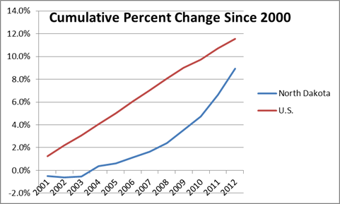
Population in the United States has grown fairly steadily over the past twelve years. In North Dakota, however, the oil boom has fueled an exponential increase in the state’s population in the last seven years:
However, that growth has not been uniform across the state, or across demographic groups. North Dakota Compass has several graphs on county-level population and change, including one that shows huge population growth in major cities and in the oil-rich western regions of the state coupled with population decline in other regions.
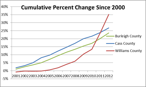
High population growth in the “oil boom” region, however, looks very different from population growth in the major cities. As you can see below, the populations in Burleigh and Cass counties (home to Bismarck and Fargo) have grown steadily since 2000. But oil-rich Williams County shows a very different pattern, with little growth in the first half of the 2000s, followed by exponential growth starting around 2005. Nearby McKenzie and Mountrail Counties have seen a similar growth pattern.
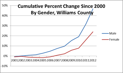
Population growth in the western region is also remarkable for its demographic patterns. While growth in Fargo and Bismarck has been driven equally by men and women, growth in the oil-producing regions has been overwhelming driven by men. As you can see in the chart below, the male population in Williams County began to increase around 2004, but the female population did not follow suit until three years later.
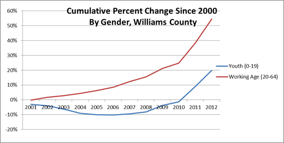
As might be expected, population growth in Williams and other “oil boom” counties has been driven primarily by people of working age, with growth in youth populations coming later.
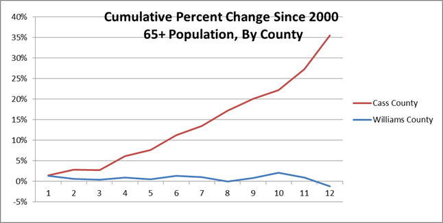
Unlike in urban counties like Cass, where the 65+ population is growing significantly, the senior population is holding steady or even declining in Williams and other “oil boom” counties.
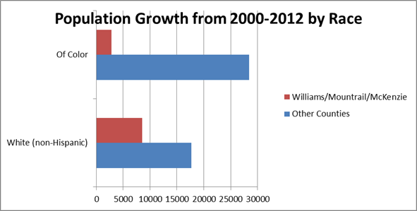
Population growth by race looks different in North Dakota’s western counties as well. Whereas people of color accounted for a majority of population growth in most of the state, population growth in Williams, Mountrail, and McKenzie counties was greater among non-Hispanic whites than among persons of color.
Outside of the cities and the oil-rich western regions, population has generally held steady or declined over the past twelve years. With the exception of Sioux County, located entirely within the Standing Rock Indian Reservation, and four counties in the “oil boom” region (Billings, Dunn, McKenzie, and Mountrail), all counties with populations of less than 12,000 in 2000 saw their populations decline over the past 12 years.
Overall population change between decennial censuses rarely tells the whole story, particularly when that change is driven by an unusual natural or economic event. Breaking the data down further yields valuable information about the way that a population is changing, which can help inform decisions around housing, business development, social services, and more.
If you are interested in looking at population change over the past decade in your own county or region, take a look at the Data & Notes section of any North Dakota Compass graph. This under-utilized feature lets users see the detailed data behind the chart, and even download that data to Excel so that you can create your own charts and graphs to tell your story.
Center for Social Research
North Dakota State University
Compass created by:
Wilder Research
© 2025. All rights reserved.